Building your Main Hero
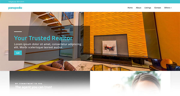
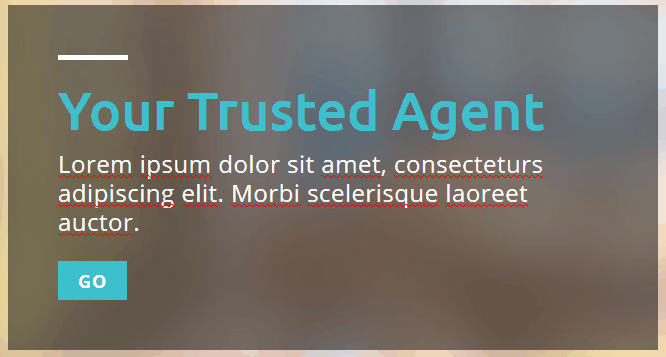
What is hero? The hero is the large banner prominently at the beginning of your home page. This is the first visual element when you have a visitor to your site, and presents an overview of your most important content.
To create, edit or delete your Hero, log in and navigate to Showcase Hero, or https://panopedia.com/account/showcase/hero.
On your Hero, you may either choose a static image, or a rotating Panotour as the background. Choose the switch on Hero Type to be either Panotour or Image at the top left hand corner.

If you select the hero type to be Panotour, click on the Choose Pano Image button on the top right hand corner and select a photo taken using your 360 camera. Or else, you may simply upload a high resolution picture if you select the hero type to be Image.
Editing the Hero Text
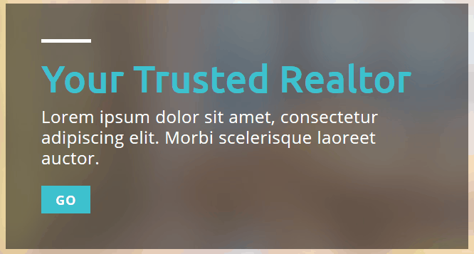
To change the default text on the hero, simply click on the ones you wish to change. If you're using a desktop, you may notice a little pencil icon appearing when your mouse is hovering over the element. There are three areas here which you may edit:
- The hero title
- The hero subtitle
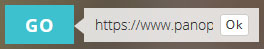
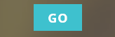
- The button text, and the target link which viewers will be brought to when clicked.
To edit the target link for the button, hover your mouse over it and a link icon will appear.

Click on the link icon and enter the full link, and click Ok.
Customisations
Customizing the individual elements on the Hero is made easy, by using the mini menu to get the options available for each of them. We have build the customizer to be dynamic, in that you can preview all the options instantly, before committing by clicking the save button.
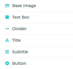
Customising the Base Image
If Image Hero is your preferred choice, you may customize how it's displayed. The base image is actually displayed as a background for the Hero Area, and there are three options here:
- Background Image Size - which you may choose how it's displayed if the image is too large for the area, or too small
- Background Image Repeat - this determines if the image is tiled or not, and the direction which it is
- Background Image Position - this determines the starting point from which the image is displayed
Customising the Text Box
The text box, by default, is the translucent dark box which encompasses your Title, Subtitle and the Button. There are five options here:
- Enable Text Box Background - you choose to show the background colour, or have it as transparent
- Background Colour - the base colour for the text box
- Background Colour Opacity - the level of transparency for the base colour of the text box
- Text Box Position - the horizontal and vertical position of the text box within the hero
- Text Align - the general alignment of the texts within the text box
Customising the Divider
The divider, in the default example is the white bar situated above the main title of the text box. There are seven options here:
- Enable Horizontal Divider - this enables you to show or hide the divider element
- Position - the default position is situated above the main title, but you can change it to below the main title, or the subtitle
- Colour - sets the colour
- Thickness - sets the vertical thickness of the divider in pixels
- Width - sets the horizontal width of the divider in pixels
- Top Margin - determines the spacing between the divider and the element before it, or the top of the text box depending on the position
- Bottom Margin - determines the spacing between the divider the element after it
Customising the Title and Subtitle
The title and the subtitle can be customized according to how you wish. There are seven options here:
- Font Family - the font type, powered by Google Fonts
- Font Size - the font size is the vertical height of the characters in pixels
- Font Weight - the thickness of the font, do note the weights are dependent on the font family and some may not have any change
- Line Height - this determines the amount of space above and below the text, relative to the size of the font
- Letter Spacing - the spacing in pixels between each individual characters
- Colour - this sets the colour of the text
- Margin Bottom - the amount of spacing between the Title or Subtitle, and the element after it
Customising the Button
The button, otherwise known as the Call To Action (CTA), is a highly visible graphic element on the hero. There are fourteen options available for you to customise it:
- Enable Button - shows or hide the CTA Button
- Background Colour - the primary colour of the button
- Hover Colour - the colour the button will morph into when the viewer's cursor is hovering over it
- Focus Colour - the colour the button will morph into when the button is being clicked
- Border Radius - the roundness (radius) of the corners of the button, in pixels
- Font Size - the size of the text
- Font Weight - the thickness of the text
- Letter Spacing - the spacing between the individual characters of the text
- Colour - the colour of the text
- Text Transform - sets whether the text will be in all uppercase, lowercase, etc.
- Padding Top - the spacing between the text and the top edge of the button
- Padding Bottom - the spacing between the text and the bottom edge of the button
- Padding Left - the spacing between the text and the left edge of the button
- Padding Right - the spacing between the text and the right edge of the button