Other General Page Elements
Besides the general Title tags, page background and body texts, you are able to customise other miscellaneous elements like Secondary Titles and Buttons.
To customise the other page elements, log in and navigate to Showcase Options Miscellaneous, or https://panopedia.com/account/showcase/options?c=Misc.
Customising the Secondary Titles
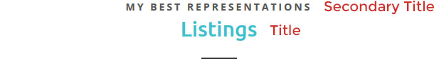
The secondary titles are texts appear above the main page or section titles. There are seven options here for you:
- Font Size - the font size is the vertical height of the characters in pixels
- Font Weight - the thickness of the font, do note the weights are dependent on the font family and some may not have any change
- Letter Spacing - the spacing in pixels between each individual characters
- Font Colour - this sets the colour of the secondary title
- Text Transform - sets whether the secondary title will be in all uppercase, lowercase, etc.
- Margin Top - the amount of spacing between the secondary title, and the element before it
- Margin Bottom - the amount of spacing between the secondary title, and the element after it
Customising the Buttons
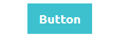
Buttons are eye catching links that will appear throughout your site.
Here you will be able to manage the colours, the text and the spacing within. There are four options on the colour and shape of the button:
- Background Colour - the primary colour of the button
- Hover Colour - the colour the button will morph into when the viewer's cursor is hovering over it
- Focus Colour - the colour the button will morph into when the button is being clicked
- Border Radius - the roundness (radius) of the corners of the button, in pixels
You may also customise the text, and there are five options here:
- Font Size - the font size is the vertical height of the characters in pixels
- Font Weight - the thickness of the font, do note the weights are dependent on the font family and some may not have any change
- Letter Spacing - the spacing in pixels between each individual characters
- Font Colour - this sets the colour of the button text
- Text Transform - sets whether the button text will be in all uppercase, lowercase, etc.
Padding is the amount of space between the text and the edges of the button. You may customise the amount of all the four directions here:
- Padding Top - the spacing between the text and the top edge of the button
- Padding Bottom - the spacing between the text and the bottom edge of the button
- Padding Left - the spacing between the text and the left edge of the button
- Padding Right - the spacing between the text and the right edge of the button